Comparing terms in Google Trends is essential to understanding a keyword fully, especially due to the tool's use of relative interest (as opposed to absolute search volume).
This guide covers how to use the feature for optimal results, plus some nuances and limitations to be aware of.
Compare 2-5 terms
Google Trends allows you to compare between 2-5 terms. Let's compare interest in TikTok and Reddit.
First, enter the primary keyword, "TikTok".
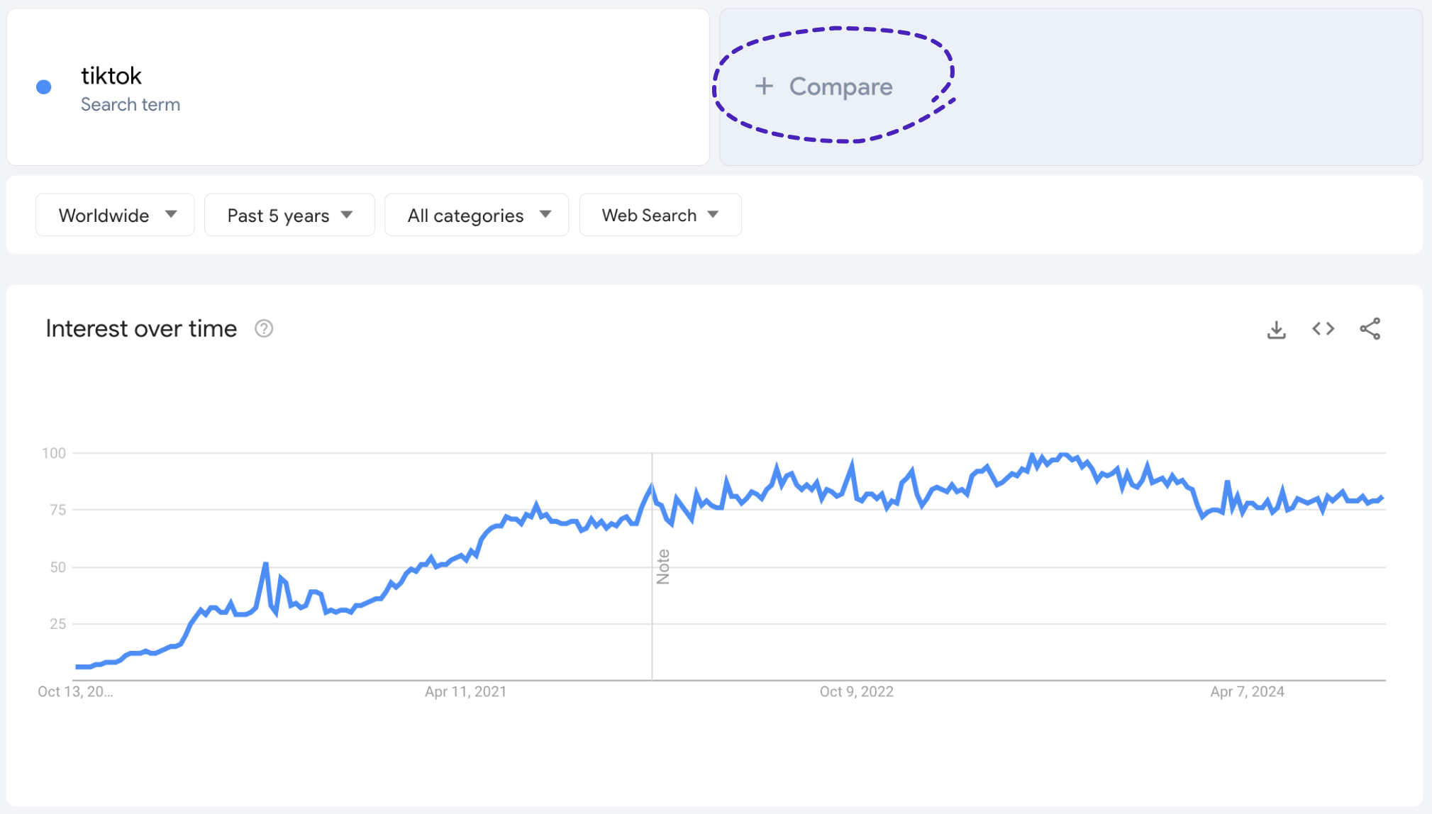
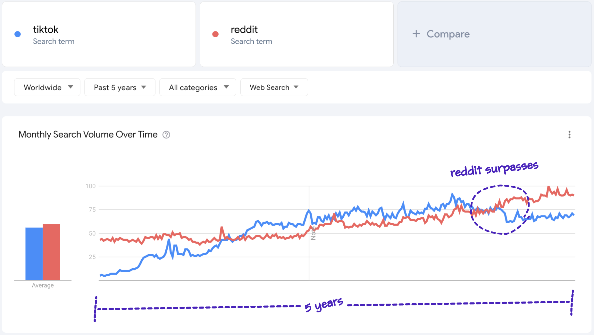
Then, click the "+ Compare" button and add "Reddit."
Each term will be shown in a different color to make it easy to compare their relative search interest. It looks like reddit recently surpassed TikTok in search interest, despite underperforming for a number of years.
Understanding relative search interest
Google Trends doesn't provide absolute search volume numbers, instead showing relative interest, meaning that search interest is always shown relative to the highest point of interest among the compared group of terms.
In the example above, reddit set the definition of peak interest (100), and now every other point for both terms is measured in proportion to that moment. This scale makes it easy to visually compare a handful of terms at same time, but it has limitations when you need precise data.
For absolute search volume and more detailed insights, you can use Glimpse, a Chrome extension that enhances Google Trends by providing absolute search volume and other features, including seasonality, forecasting, and more.
Compare more than 5 terms
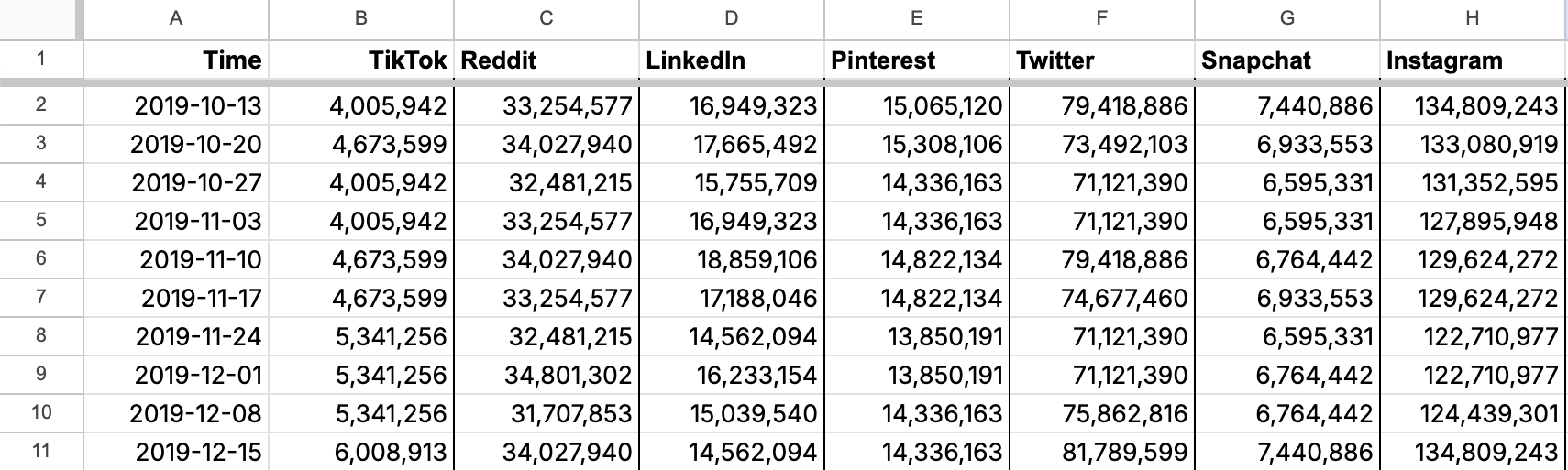
While Google Trends only allows users to compare up to five terms, you can use Glimpse to overcome this limitation. Let's compare the absolute search volumes for TikTok, Reddit, LinkedIn, Pinterest, Twitter, Snapchat, and Instagram.
Install the Glimpse Chrome extension.
One at a time, enter each term in Glimpse and download as CSV.
To export into Google Sheets, simply click ‘Open in Google Sheets’ at the top right of the "Monthly Search Volume Over Time" section.
If you prefer Excel, you can download the CSV by clicking on the 3 vertical dots to the left of the Glimpse logo, then clicking the “download” icon.
Create a blank CSV and enter the headers "Time", followed by each query you want to compare.

Copy and paste individual data into your newly-created sheet.
Open the CSV of each term. Copy the range of dates from the "Time (week of)", then paste under the "Time" header in the new sheet.
Only do this once, and make sure the dates are the same across all individual sheets. This should be true if you downloaded all the sheets at the same time with the same parameters.
After pasting in the dates, copy the "Search Volume (Absolute)" data and paste under the corresponding header in the new sheet.
Repeat this process for all keywords until you have the absolute search volumes for your range of terms across the same dates in one sheet.
Lastly, select all of the pasted data, including the headers, and click Insert > Chart to chart the data. To adjust or customize the data, you can double click on the graph to access the chart editor.
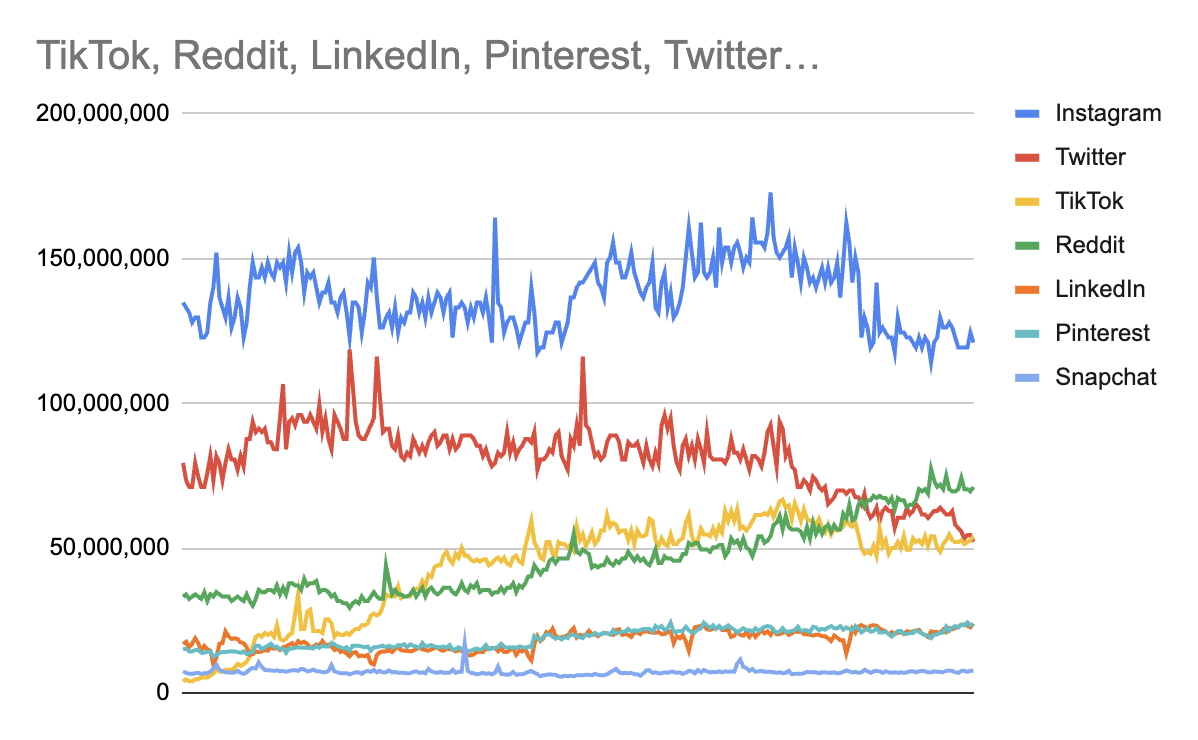


And that's it! You now have a graph comparing more than 5 terms' absolute search volumes. You can repeat this with any bucket of terms to overcome Google Trends' built-in cap.
Compare terms by Region
In addition to comparing search terms' interest over time, you can compare interest by region.
After adding two or more terms, this section displays the top regions sorted by the percentage of the combined search volume that is attributed to your primary term. Let's use a simpler example for this section, like "sunscreen" compared to "coat."
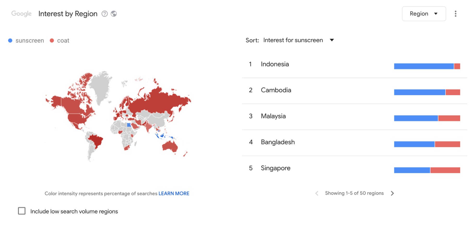
Indonesia ranks the highest, with searches for sunscreen making up the majority of the two terms’ combined search volume. Conversely, Egypt shows a majority interest in coats. If needed, you can view the exact breakdowns by hovering over the blue and red bars.
Lastly, the map also shows that coats dominate most regions, with only Indonesia and a few other Asian countries showing a preference for sunscreen.
This data can help provide a better understanding of global or regional preferences across topics; learn more about using Google Trends' regional insights for keyword research and product research.